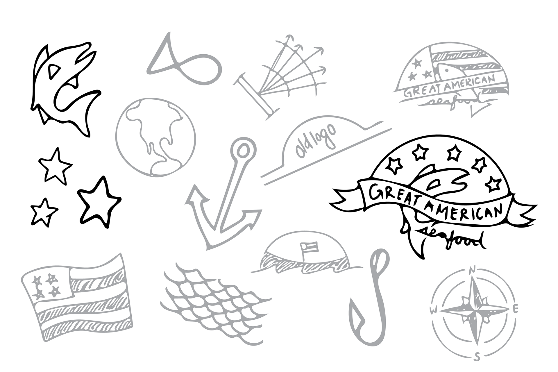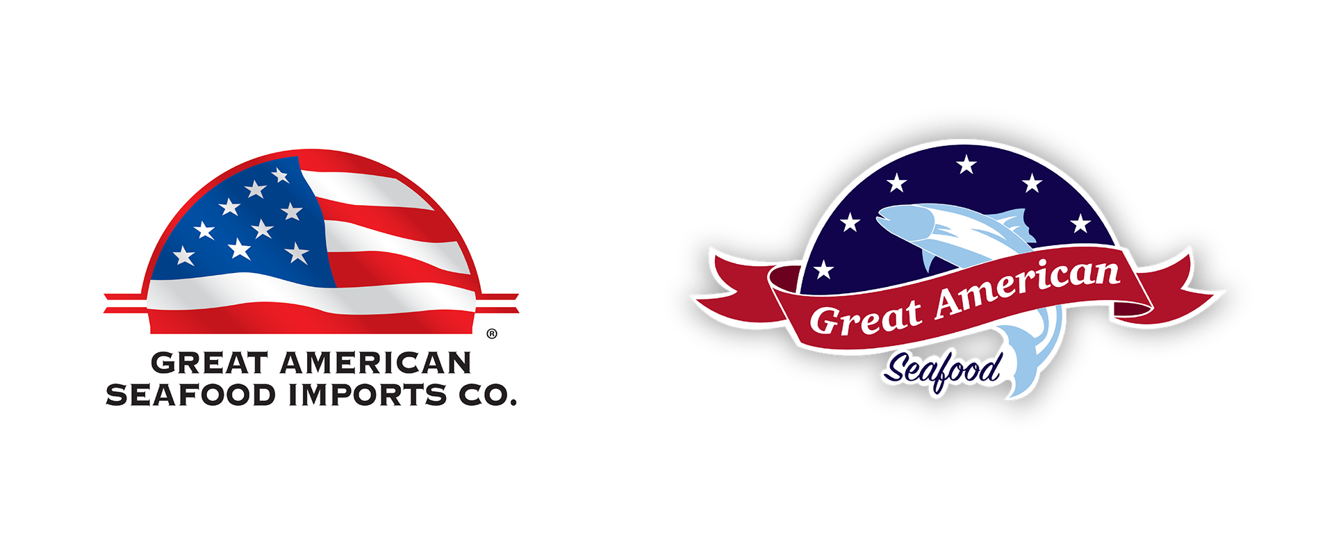
One of the largest seafood distribution companies in the U.S. looked to rebrand and better represent their business. Their goal was to modernize their look and emphasize who they were as a seafood distribution company while keeping a tie to their American roots.
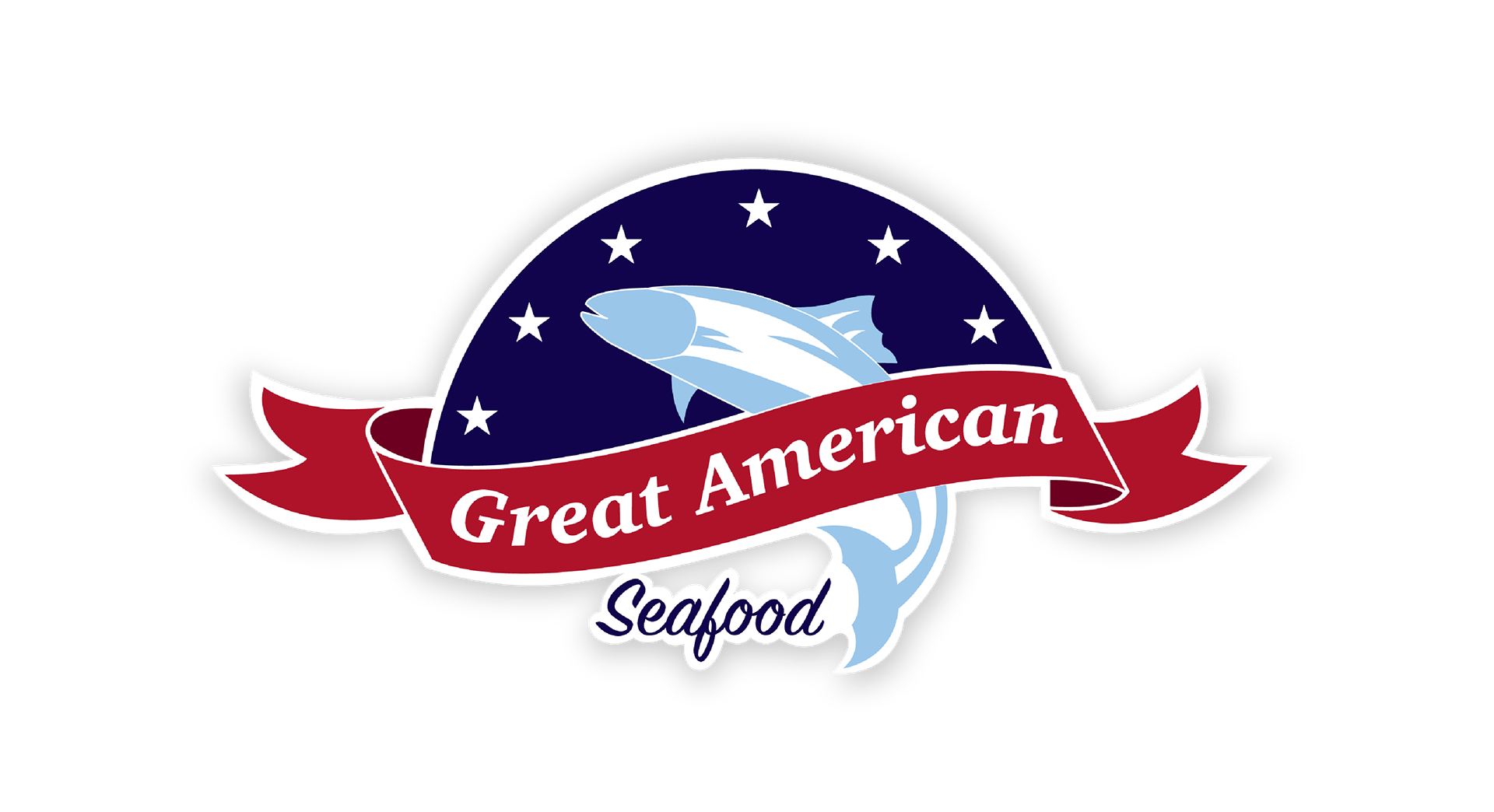
To not lose its identity entirely, the half circle remained as the template for the new logo. The American theme held through use of deeper reds and blues, as well as by keeping six stars along the border to reference the American flag more abstractly. To make the brand quickly identifiable and help consumers tie a product to the name, the logo now includes a fish icon. This allows the logo to stand alone and still clearly represent a seafood company.
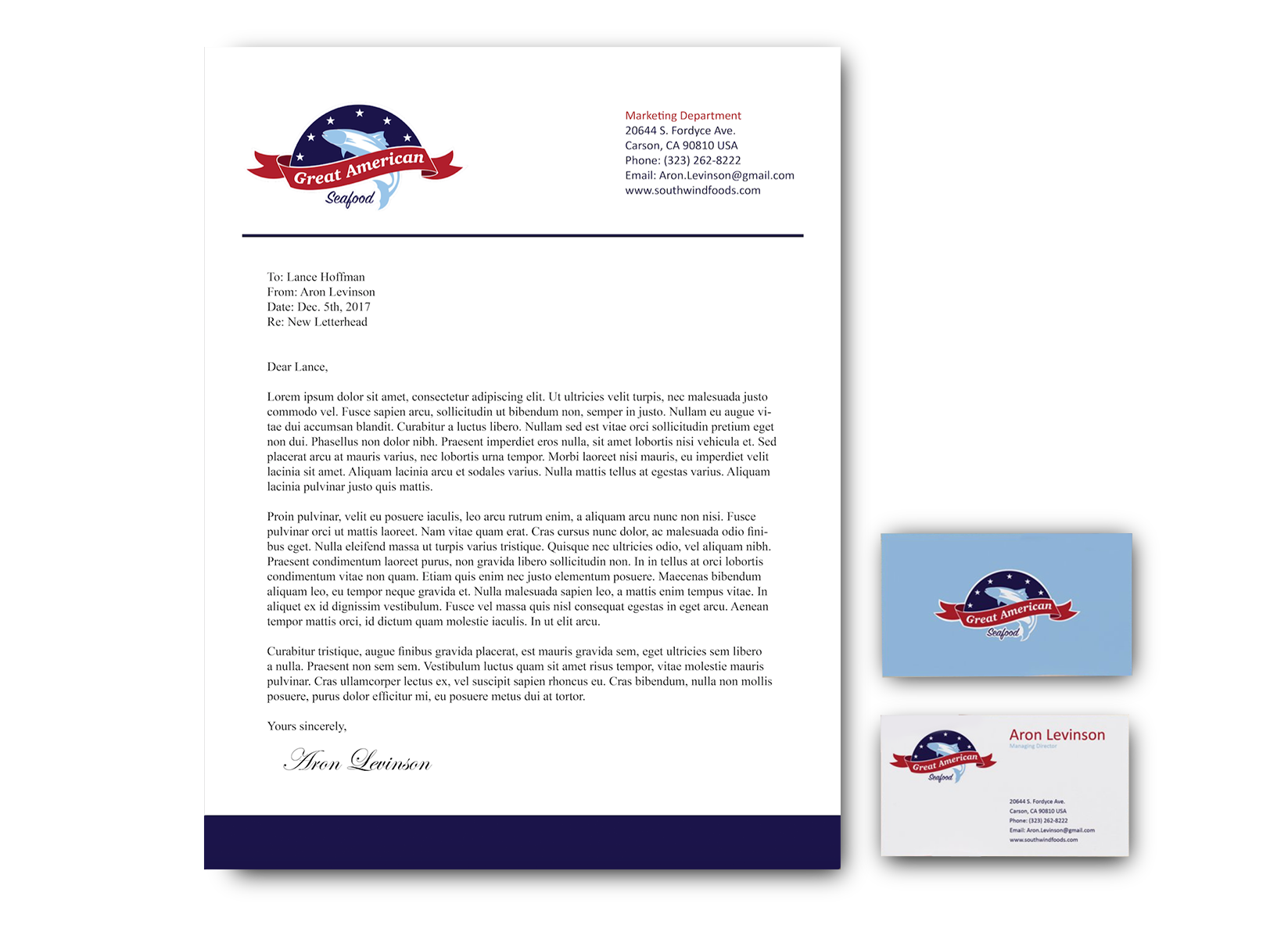
Through use of color and simple icons, the logo became easily expandable to other aspects of the brand.